When I joined Bio-Techne, I was asked to completely redesign one of our subsidiary companies: Tocris Bioscience. Tocris is one of the top reagent manufacturers in the UK. They have a long history in the industry, but Bio-Techne acquired them to improve their European presence. After the dust settled from the acquisition, my team began planning the redesign. Let’s start with a quick before/after shot, and then we’ll dive into the changes. Slide the arrows on the image below to the left or right to see the Tocris website before we started working on it (left) and after it was finished (right).
[twenty20 img1=”7150″ img2=”7149″ offset=”0.5″]
Overall Design Aesthetic
I didn’t have complete design freedom for this project; it was my first project for Bio-Techne, after all. While some of my inspiration came from the existing company websites, I also referenced standardized design concepts based on popular guidelines like Material Design. Ultimately, our stakeholders asked for something clean and “science-y” — that’s certainly a starting point, but I added modern, simple, and usable to the list as well. Since the Tocris design would slowly roll out to our other Bio-Techne websites, I needed buy-in from stakeholders across the company. It sounds daunting, but when your role defines the design standards for a company that previously had none (and you’re good at it), you’ll find your stakeholders ready and willing to get on board.
Everything we did for this project became the foundation for the next three website projects at Bio-Techne. I’ll cover the unique aspects of those website projects in future portfolio pieces. For now, I need to stick with high-level concepts. We put an incredible amount of time into researching and user testing every aspect of this redesign… I would have to write a book to convey the care given to this project. Bio-Techne is a billion-dollar company, so we took it slow and made sure we did everything right while maintaining the philosophy of rapid development and iterative design in an agile environment.
Header Redesign
 The new header for the website includes the Bio-Techne brands bar, the individual company logo, a large search field, cart information, account access, the internationalization tool, and the main menu… phew! Since I couldn’t convince the marketing department to update or replace the brands with a better design, I did my best to make it fit the new design direction. First, we replaced all the brands bar assets with retina-compatible images, flattened the images, and adjusted the colors. Then we re-built the code to make it responsive with adjustments for each Bootstrap desktop breakpoint. After finishing the brands bar, we started putting the other necessary elements into place and removed unnecessary items like social links.
I believe a good user experience dictates a clean and usable interface that offers users the same interactions on every device. Unfortunately, the marketing department chose to hide the brands bar on mobile (we adapted everything else). While it breaks my UX philosophy, it’s better to hide it than to clutter the mobile interface. If it were up to me, I would have done cross-site promotional content elsewhere on the site instead of relying on a massive gray bar in the header. C’est la vie.
Homepage Redesign
 The team redesigned the homepage from the ground up as a CMS page. We worked with the marketing team to implement a new page featuring a large rotating content slider, targeted box-links to showcase products, category tiles, and other information. We accomplished all this while ensuring the design translates well from the largest desktops to the smallest mobile devices. Tiles would eventually become an integral component of our new global design styles as they create a content-rich, easily-consumable design with calls-to-action that offer the customer a way to quickly scan what’s new.
Tocris also had a bad habit of using long lists of bulleted text links. If you think about it, that design gives mobile users an extremely small touch target (in this case, 14px) to click the correct link. This is woefully insufficient. Apple’s iPhone Human Interface Guidelines suggest a minimum touch target of 44px. I find it annoying that Apple stopped following their own recommendations, but I was certainly going to fix that problem for Tocris. Instead of bulleted text links, we created linked image tiles with a title and the option for a brief description. These tile elements became a massive part of the global redesign and tested extremely well during user testing. In scenarios where we didn’t want images replacing bulleted links, we moved to a wider button style that improved our touch targets to 35px. While that’s not the recommended 44px, it was a tremendous improvement for mobile without hurting the desktop experience.
Main Menu Redesign
 We completely redesigned the main menu to provide a clean user experience that includes a mega menu for the main product categories, the ability to highlight newly updated product categories with brightly-colored tags, and standard dropdown menus for non-mega sections of the menu. We also re-organized the top-level-menu content into new parent categories to simplify the overall link structure. Since the new menu items live in the CMS, our content managers could finally edit the menu as necessary without a code push. Lastly, we modified the default Bootstrap menu behavior to accept hover interactions to encourage discoverability within the menu content.
Mobile Menu Design
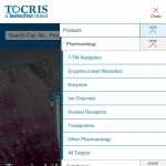 While we kept the design of the main menu on the desktop clean and simple, it’s still a very complicated link structure that includes several sub-layers. Upon first open, the mobile main menu shows the top-level-menu items with the ability to expand and hide the sub-level items for each. This takes a relatively complicated link structure and simplifies it for mobile in one of the most universally accepted user experiences available. Since we needed clickable top-level-menu items with sub-levels nested underneath, we added a large show/hide button to each top-level-menu item. We relied on color, border thickness, and positioning to illustrate the menu hierarchy. We did not rely solely on color because color is not an accessibility-friendly way to differentiate between objects. While there are obvious visual differences between the desktop and mobile menu layouts, it utilizes the same code for each layout and ensures familiarity in the user experience no matter what device you’re using.
Search Redesign
 We scrutinized every element on the site from a responsive, mobile, and user-experience perspective. Search was one area that received significant attention. We researched filter styles, product comparison designs, organization by category, and filtering concepts to come up with the new search interface. Since search is the main way our users interact with our website, we focused the user flow on conversions. We show the users all the necessary information in a clean and organized layout (on desktop and mobile) so they can spend less time trying to figure out what they’re looking at and more time buying our products. Even our mobile users see the same simplified layout; there’s no difference in content between desktop and mobile.
Datasheet Redesign
 One of the biggest challenges of a responsive design is organizing data-heavy content in a way that works for desktop and mobile layouts. We accomplished that with our datasheet redesign by creating organized sections that collapse as the screen becomes smaller without losing any of the valuable data. The mobile design specifically mirrors that of the desktop to ensure user recognizability no matter how they visit the Tocris website. Further still, we adapted every element to be simple, clean, and responsive so the smallest screens get the same user experience as larger desktops.
Footer Redesign
 We created a new footer design that would eventually end up on all the redesigned Bio-Techne websites running this new global framework. Our stakeholders requested brand-specific links, support information, global branding links, and a social/connect section. We put each of those requests into their own column and added some color. Each footer column collapses vertically on smaller devices while retaining the same visual design. We also made the footer editable in the CMS so changes don’t require a code push. This was a significant improvement over the previous footers as they were crammed with unnecessary information and incredibly tiny text. Since implementing this design, user interactions with the footer content have dramatically increased.
Retina Compatibility for High-Resolution Displays
 In addition to responsive design, we added retina image capabilities to the Tocris website to ensure our images look great on every device. Most modern devices (phones, tablets, and computers) ship with high-resolution displays that dynamically “pixel-double” images to make them sharper and clearer. Without this design addition, our images would appear pixelated on almost all mobile devices and even some computers. Click the Tocris image to see a basic example of the difference between non-retina images and a retina image. Not everyone can see the difference (it’s noticeable depending on your eyesight), but there’s a blurry quality to the top logo and crisper edges on the bottom. If you’re having trouble seeing the differences, check out the registered trademark symbol in the top right corner of each logo.
Everything Else
As I mentioned, I wanted to focus on high-level concepts for this portfolio project, but I still want you to be able to see everything else we accomplished during this redesign. Here’s a longer list of technical things we did to the website. If you have any questions about the list below, I’d love to discuss them with you. Give me a call or use the contact page to get in touch with me.
Improvements outside of code: Single SOLR Slice, Acquia Development Environment, Akamai ION Platform, and New Relic Monitoring.
Improvements to code: Shared Codebase, Worldwide Purchasing Capabilities, SOLR-Based Redirection, Geo-Location Technology, E-Commerce Analytics, Multiple ERP Capabilities, CMS Integrated SEO, Product-Level Caching, Search Boosting Capabilities, Fully-Integrated JSON-LD Schema Tagging, Product Reviews, Account Document Storage, Search Compare Tool, Content Translation, Search Term Replace Capabilities, Search Advertisements, and Site unit testing.
Wrapping Up
Leading the Tocris redesign was challenging and fun for me because I needed to organize a massive amount of data into a clean and usable interface. While I didn’t re-invent the wheel with this project, I designed and built everything from scratch to deliver an excellent user experience to our customers. As with all projects, we translated incoming feedback into improvements to our global design standards to further improve the user experience. Tocris has grown tremendously since the redesign and will continue to do so as we continue our design, build, test, and iterate philosophy.
