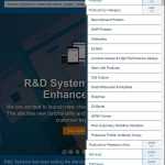
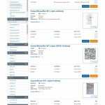
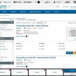
After the successful redesign of the Tocris and Bio-Techne websites, it was time for my team at Bio-Techne to begin updating the original company website: rndsystems.com. Our focus for this redesign was responsive content, as well as improvements to the user experience and underlying web technologies. With 500,000 active products in the database, we had our work cut out for us. We defined personas, gathered data on the usage of the current site, and listened to the improvements our stakeholders desired. After a few conversations to tighten our scope, here’s what we did to increase our conversion rate:
- A Focus on User Experience
- Responsive Content
- Header Redesign
- Main Menu Redesign and Restructuring
- Mobile Menu Design
- Slider Redesign
- Footer Redesign
- Retina Compatibility for High-resolution Displays
- Homepage Content Redesign
- eCommerce Search Tool Redesign
- Product Category Browser Redesign
- Responsive Product Comparison Tool
- Product Page Template Redesign
- Luminex Assay Tool Redesign
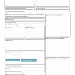
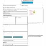
We tackled this in an Agile, Lean UX environment using sprint-ahead methodologies that ensured proper time for our designers to research, collaborate, and test individual designs before passing them to our development team. After our initial ideation sessions, we created wireframes for stakeholder approval. Next, my designers created high fidelity prototypes for stakeholder approval. In the before and after image below, you see our first prototype and the final prototype after accounting for stakeholder feedback and other design system iterations.
[twenty20 img1=”7789″ img2=”7787″ offset=”0.5″]
Then came the front-end developer handoff to build out the necessary template code using pre-existing objects in our atomic pattern library. Afterwards, the back-end developers provided functionality and pulled content from the database. Then, I personally checked each user story for proper translation from design to code. Lastly, the QA team completed their testing procedures before we marked the changes as ready for launch. Rinse and repeat for each story in the redesign. It was an awesomely-complex eCommerce project in which I thoroughly enjoyed leading the user experience. This is an over-simplification of the process, but I’ll leave it at that for now. If you would like more specifics on how we achieved this marvelous feat of modern engineering, I’m happy to share more over a cup of coffee. I’ve included a few more pictures of the process below, including a few showing our initial wireframes and the iteration process of our high-fidelity prototypes.
UX and eCommerce
My team successfully put the user first for this redesign. I encouraged my teammates to remove themselves from the conversation and think about the story from the perspective of our users. I constantly asked my team, “If what we’re doing isn’t making their path to purchase easier, why are we doing it?” That qualifying question saved us from days, maybe weeks of scope creep.
We did a full template rewrite to accommodate our newly responsive designs for the content of the website, but this was previously a static-templated eCommerce site… we had so much more to consider. R&D Systems (and its parent company Bio-Techne) may not be a household name, but they’re the biggest name in the antibody industry right now. They sell nearly everything in the antibody supply chain and often claim that their products will be used to cure cancer. The scope of their eCommerce catalog is tremendous.
Considering that, most of my time was spent researching, testing, and improving the user experience of their eCommerce catalog with a focus on converting sales. In our testing, we found that our customers were more likely to complete a sale when they didn’t have to scroll down to complete a purchase. This does not align with other industry research, but this shows the advantage of testing with your actual users. Many of our users are uninvested research students renewing stock levels for hundreds of items; they don’t want to see anything but the add-to-cart options so they can move to the next product on their list. Our customers enjoyed the newly-designed user flows so much that many of them decided to order more stock more often.
We also researched the UX of standard eCommerce considerations like search result organization, data architecture, product comparison, variated layouts, review optimization, and more. We studied the analytics and included real user testing to supplement the research we found for each feature requirement.
Shortly after launch, we observed a boost in our conversion rate and customer satisfaction. While most of us moved on to the next Bio-Techne subsidiary redesign, we still monitored analytics, user testing, stakeholder inquiries, and customer feedback to ensure the user experience was always improving.
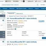
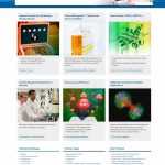
I’ve included a gallery of the end results below, but you can always head over to the website and check it out for yourself: rndsystems.com.
As a final bonus, here’s a before and after of the R&D Systems homepage:
[twenty20 img1=”7168″ img2=”7167″ offset=”0.5″]
