When I first started at Bio-Techne, we were just beginning to accommodate mobile design and needed to create a seamless user experience for our desktop and mobile web, as well as our future iOS and Android products. I’ve written previously about my love of centralized design systems and pattern libraries – I truly believe they’re the best way to create unity within your products – so we started researching existing design systems and standards. We came up with a universal aesthetic that would be the future of Bio-Techne software. If you’re looking for an example of my design system work, check out this portfolio piece from my time at Avaya. In this piece, I’d like to specifically discuss the iterations of our mobile designs.
Bio-Techne’s products are scientific and require the presentation of many data points to allow our users to make educated purchasing decisions. Instead of creating a mobile-first design, we needed to adapt our desktop content to work with mobile. Desktop-first is a tough ask, but we created the universal design system and pattern library for this specific purpose. After all, we weren’t just building a mobile eCommerce platform… we needed our software to work everywhere, on every device, in every country on the planet, with a consistent user experience. Let’s dive in with the first high-fidelity draft of our product search design.
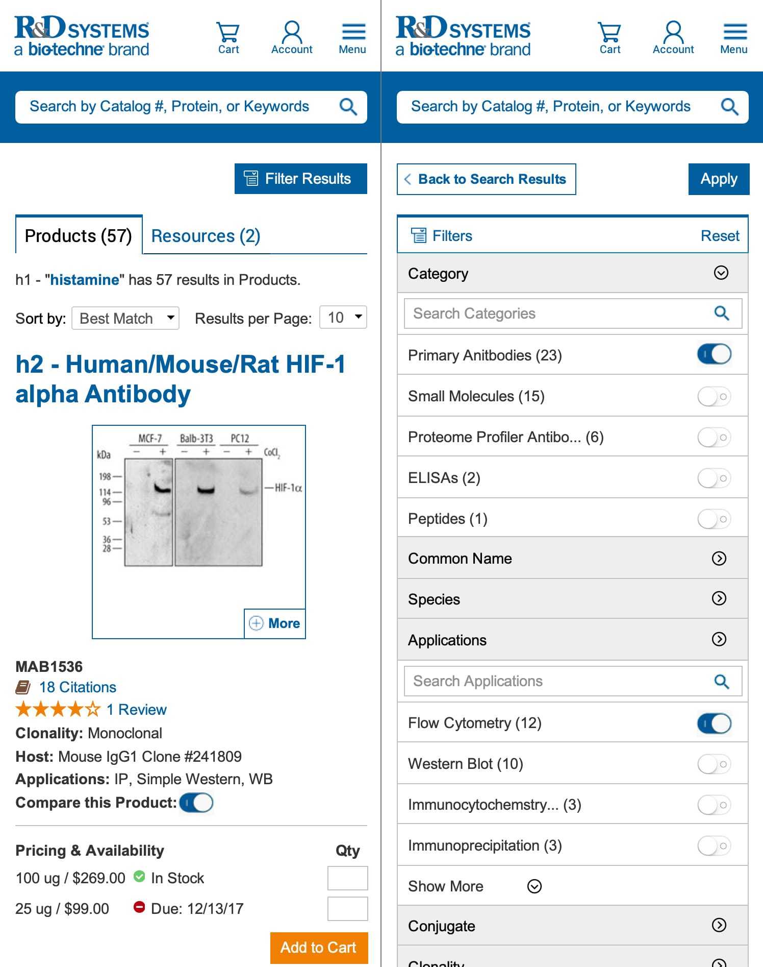
This image represents my high-fidelity interpretation of the wireframes we created with our stakeholders, existing customers, and development team. I love design collaboration and working with my teammates to create a great user experience for each of our personas. I also love research. We spent a lot of time user testing these designs with one-to-one interviews, surveys, and comparing those results with our real-world data gathered through analytics. This is a basic first take–it lacks the evolution, polish, and consideration of the final design–but it excited our stakeholders and sparked even more creativity in our collaborative process. After a few more iterations, we had our final launch designs for the product search results and the associated features.
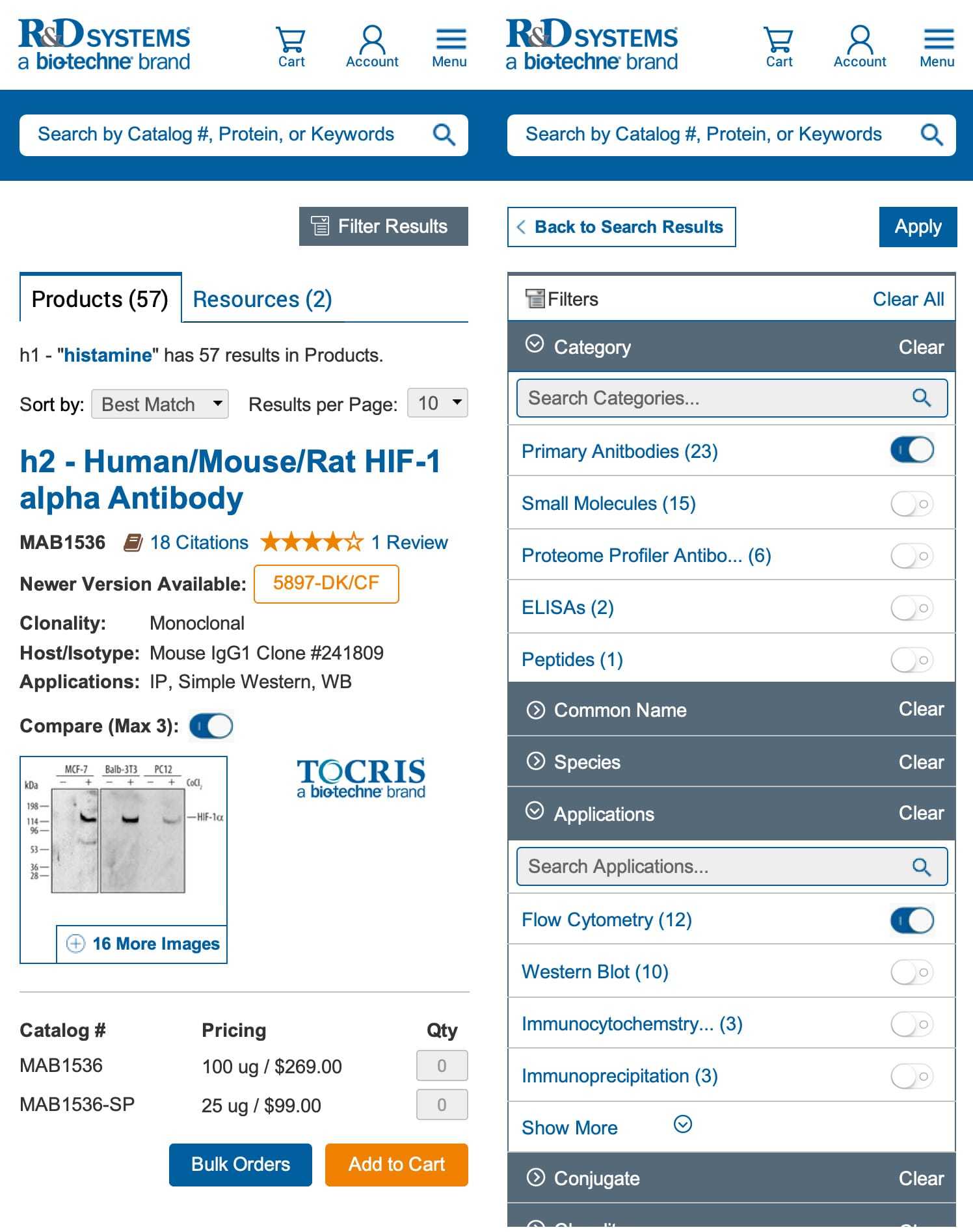
In this fifth iteration, you’ll notice many of the design system objects have been updated to their final assets including buttons, input fields, dropdowns, etc. Even still, this is just the aesthetic we used for the re-launch. If you visit the website now, you’ll notice even more improvements to the product search design. Updated iconography, new search filter designs, cleaner images, and more polish – nearly all of these improvements were based on suggestions from our customers. I love feedback, qualifying it with actual data, and using those suggestions to improve my designs.
I’ll leave you with one final thought about these designs: we worked very hard to ensure they were device independent. Hopefully, you noticed design inspiration from Material Design, Apple’s Human Interface Guidelines, Microsoft’s Fluent Design, and even some influence from Twitter’s Bootstrap framework. Most of these design systems have been vetted for a good user experience and accessibility, but some designs are certainly better than others. We pulled the best and most accessible designs from each system, tweaked them to satisfy our strict requirements, and developed a design system that feels at home on any platform. I hope to continue this trend in any role I take moving forward. A consistent user experience is my top desire for the software I create; a great design system and pattern library is the best way to ensure that for iOS, Android, or the web.