In the last few years, Avaya has started focusing on the user experience by adding improved software products to their lineup. I managed the UX of video clients, soft phones, and Salesforce-integrated web apps. In this portfolio update, I’ll focus on Avaya Agent for Desktop which my team and I made enjoyably efficient by implementing a design system, updating the aesthetic, grouping interactions, and fixing accessibility issues.
Over the last six months, my team and I worked on a design refresh with a heavy focus on usability and accessibility. A customer support team asked if the Avaya would accommodate their accessible team members — that request ultimately got me hired. AAfD 2.x was our opportunity to take all the good from 1.x and bring it into a user-centered environment.
Building a Design System for Avaya
We began by sharpening the team’s focus on UX and accessibility by utilizing design systems, pattern libraries, and style/branding guides. Defining these standards offered us the freedom to think creatively while staying inside a vetted user experience. With a design system, designers and developers could choose an existing pattern that satisfied the user stories without having to blaze a new trail. Our teams began building out our new designs with improved efficiency.
We referenced Material Design, Apple’s HIG, and Microsoft’s Fluent Design System during the creation process. The team also ensured these changes weren’t a radical departure from Avaya’s current aesthetic. This also allowed us to create something familiar, and entirely proprietary, all while accommodating the usability and accessibility mandate.
Creating Assets for the Design System
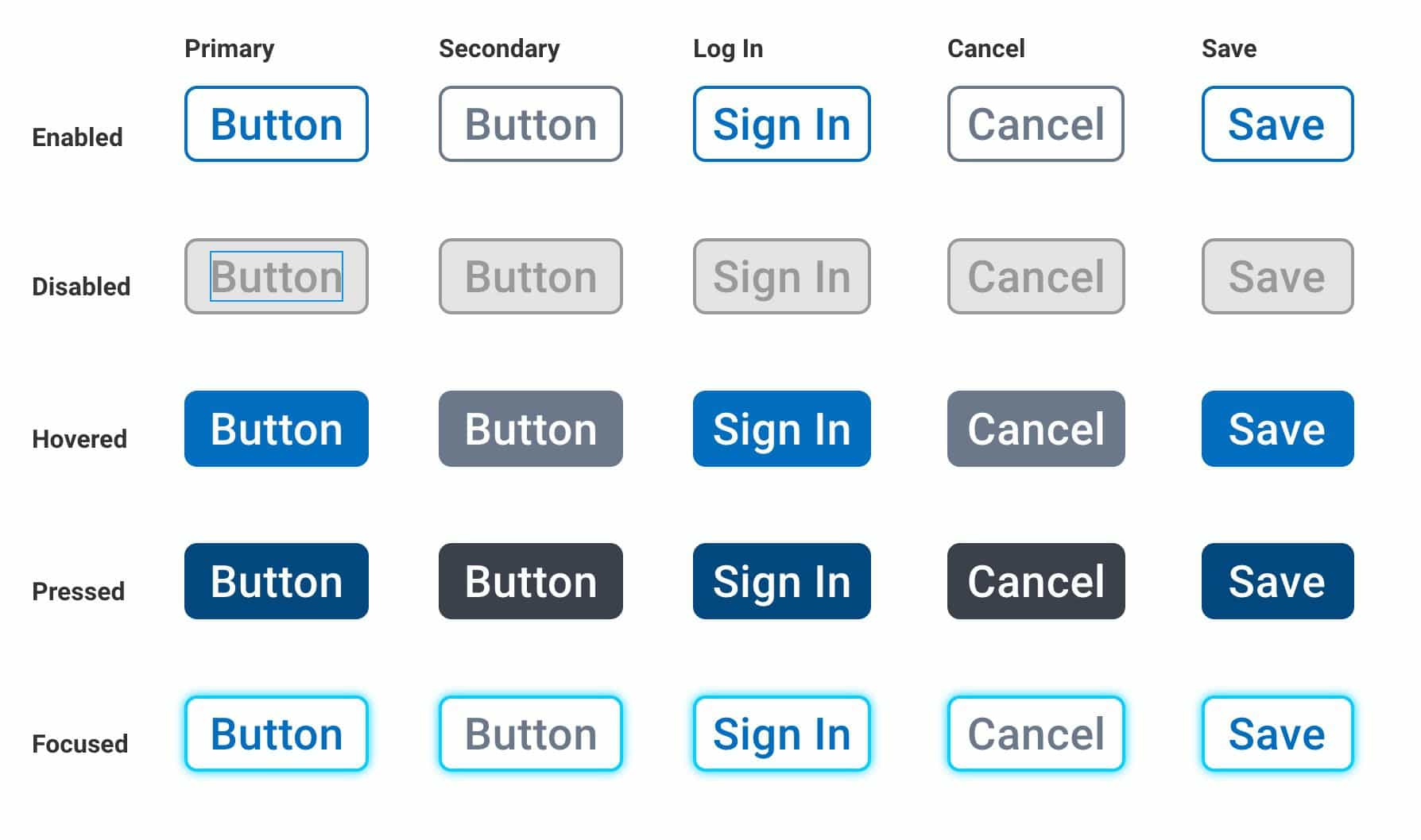
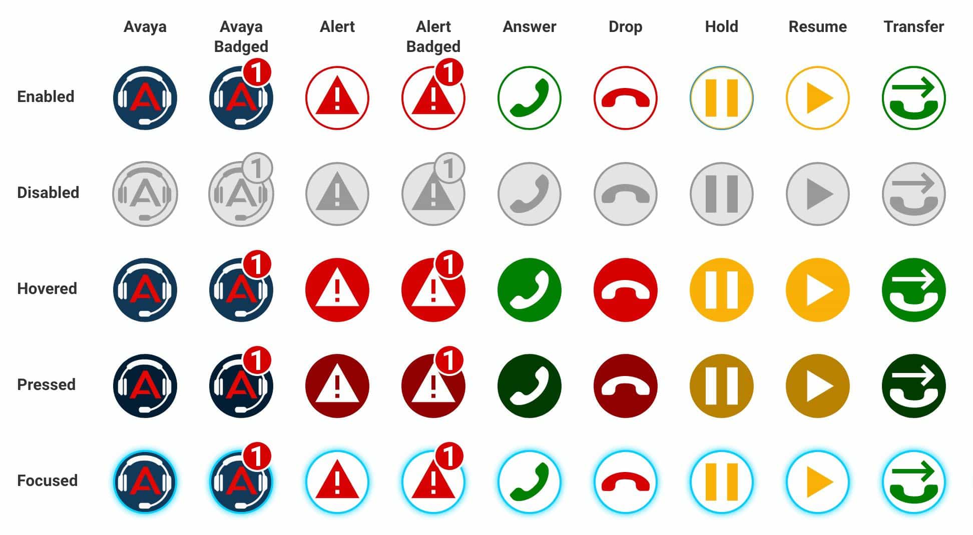
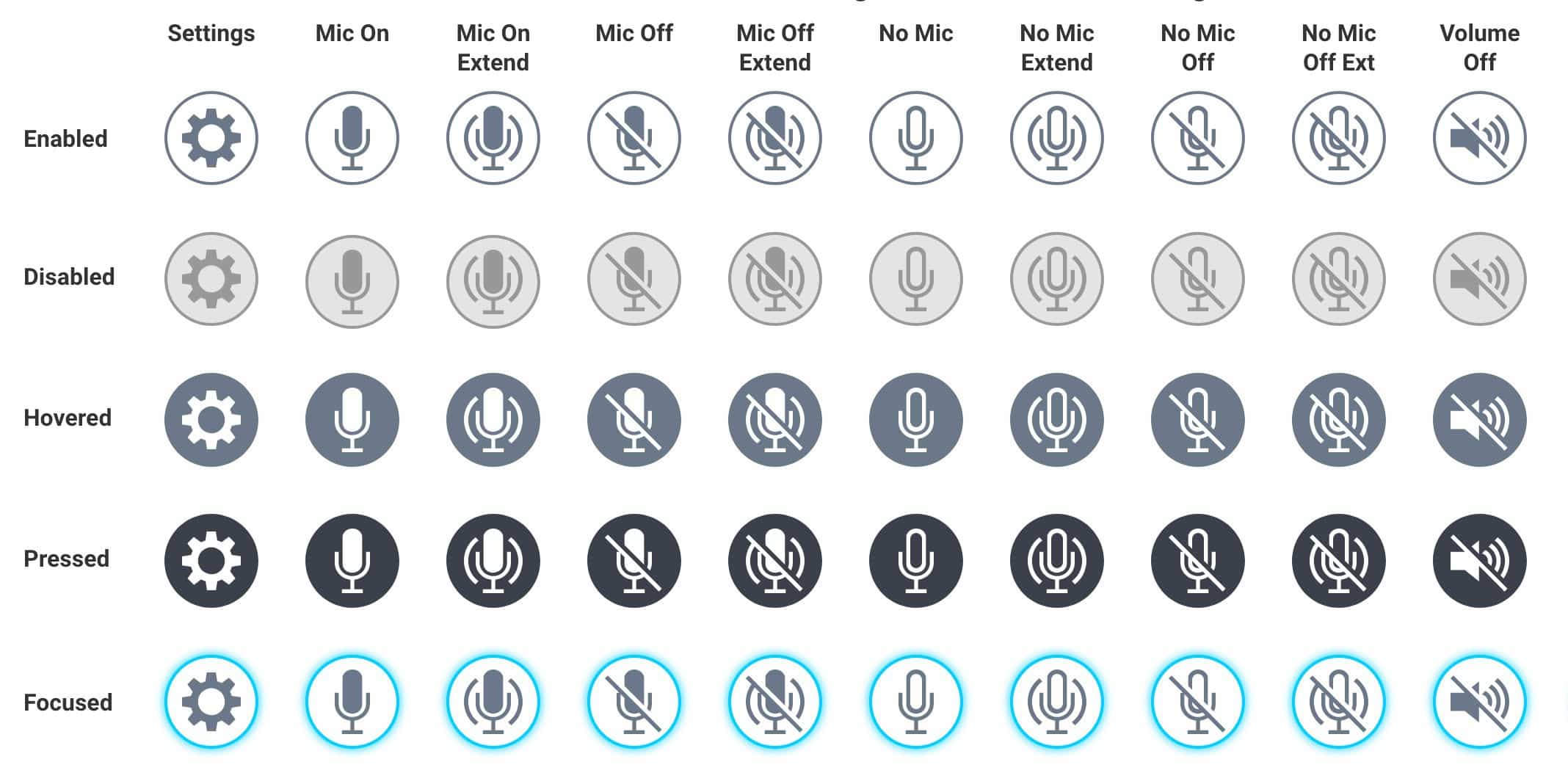
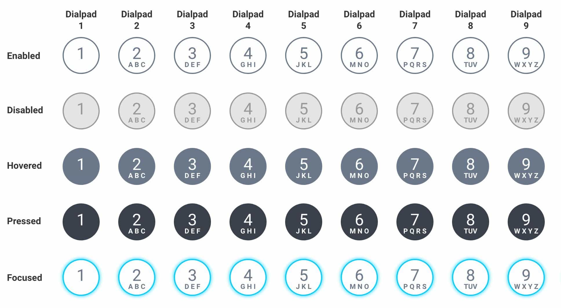
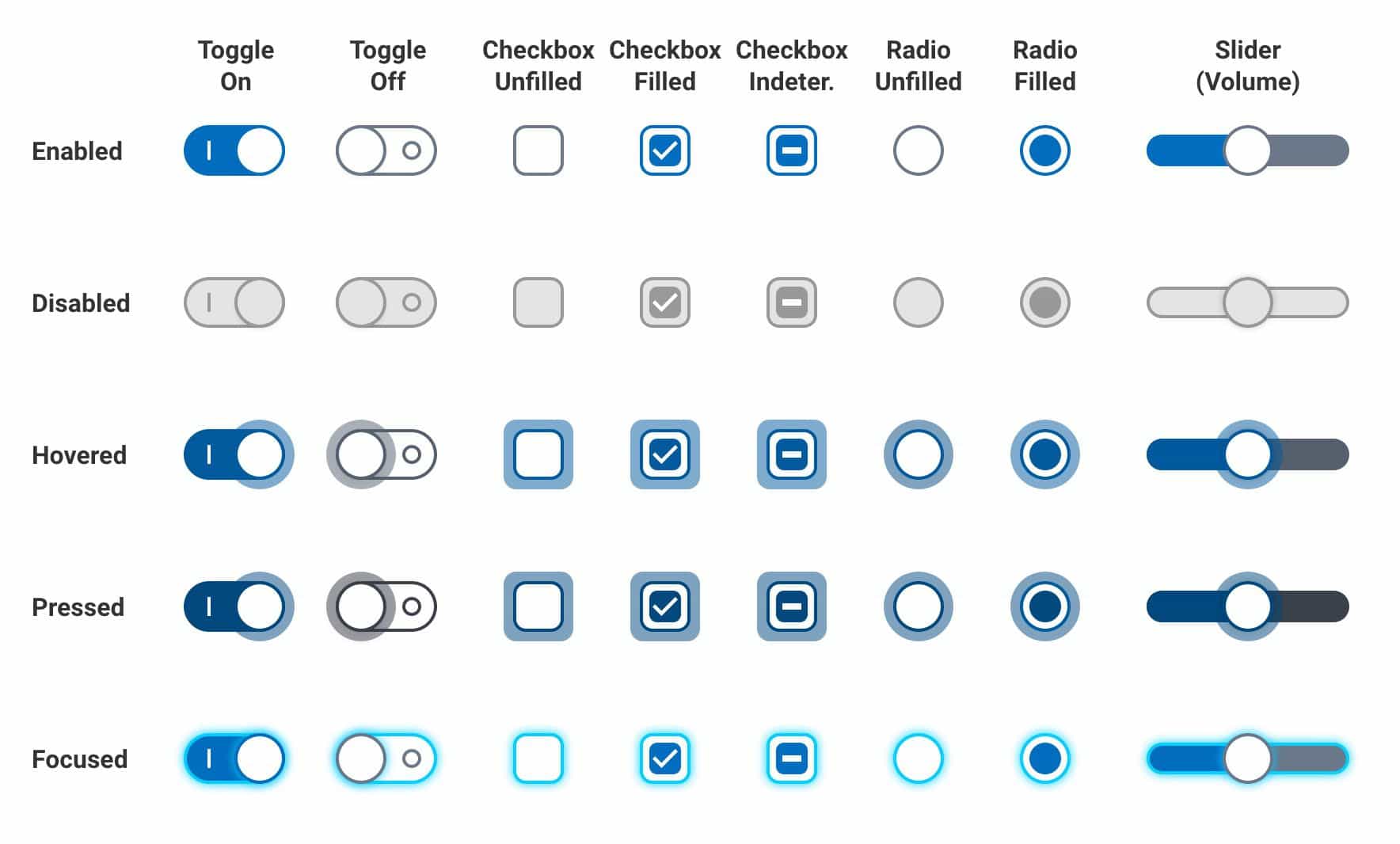
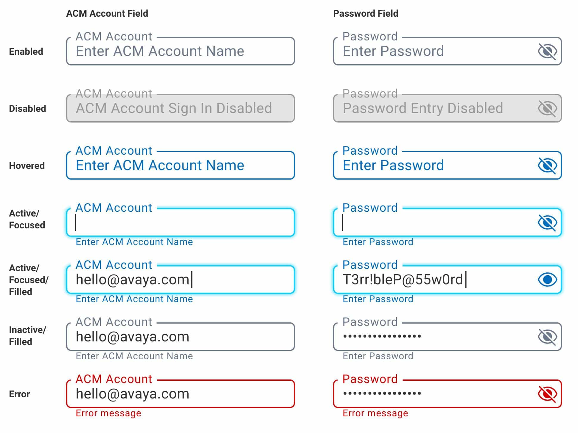
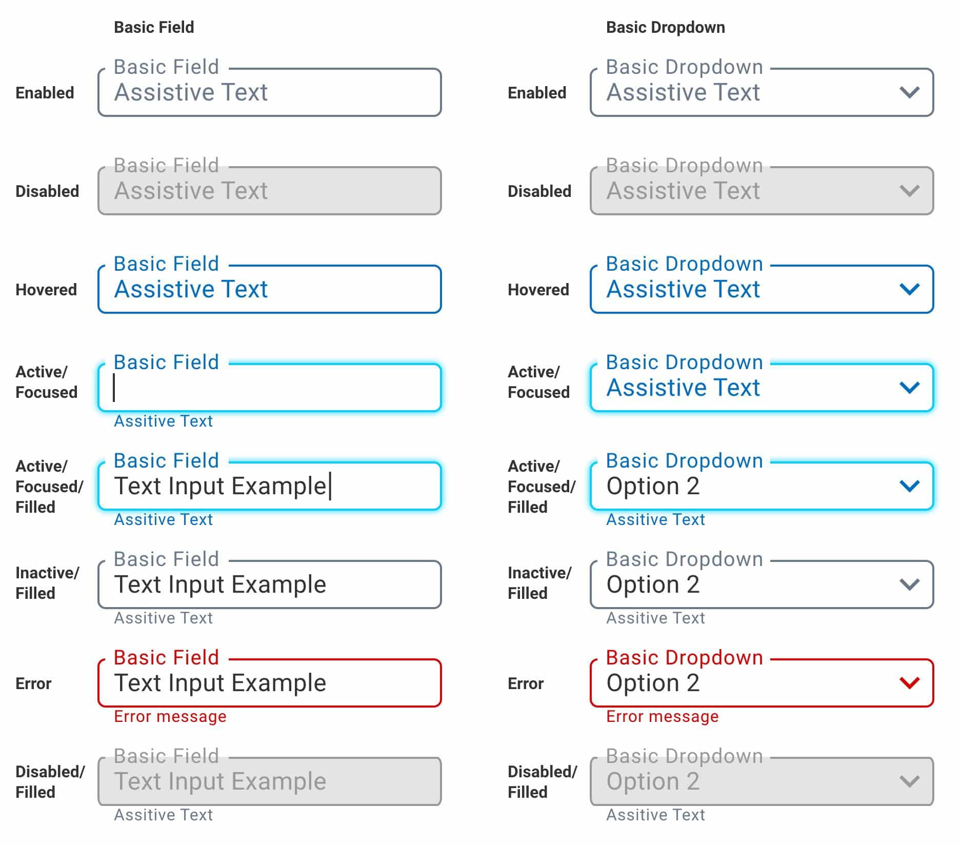
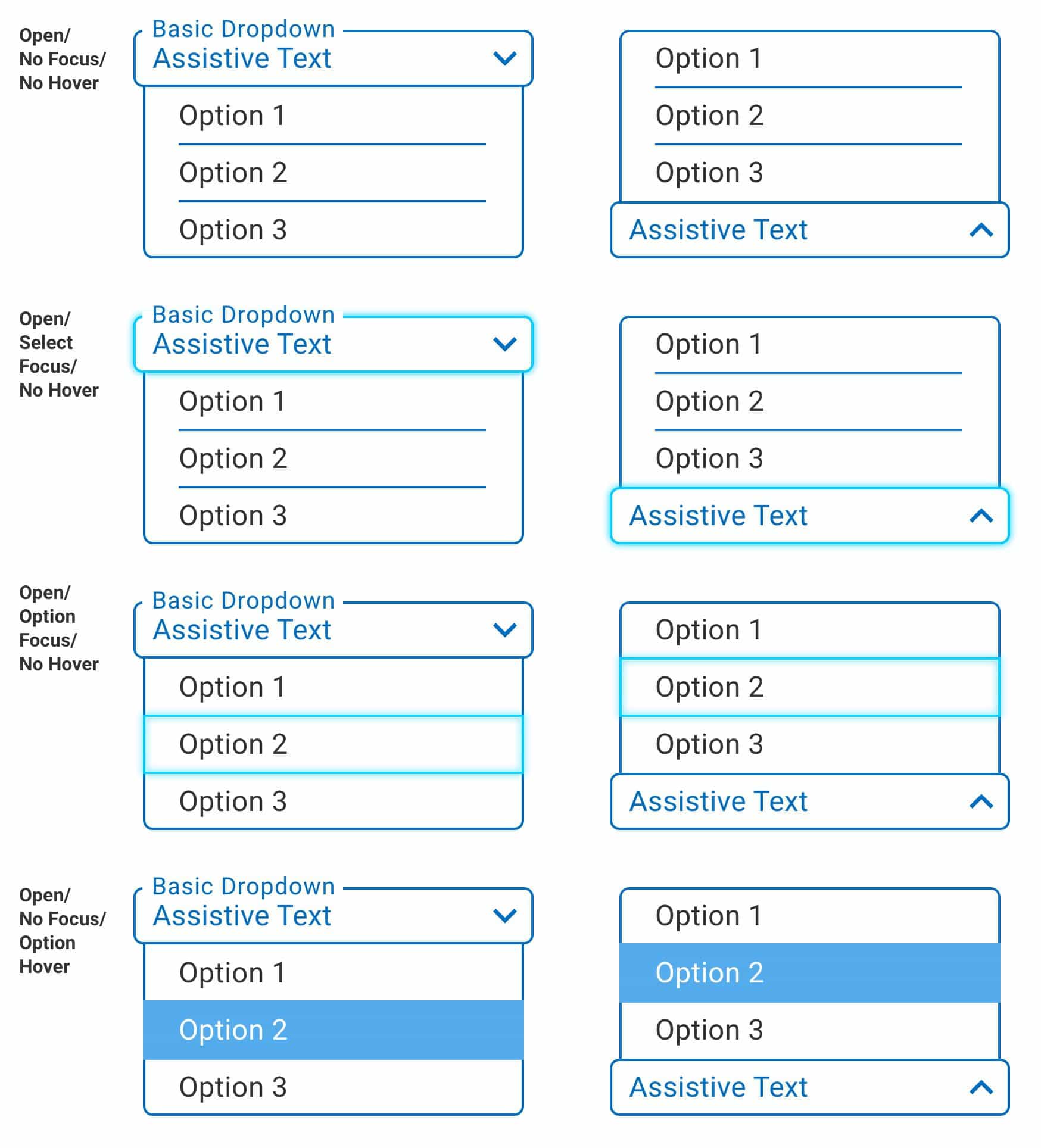
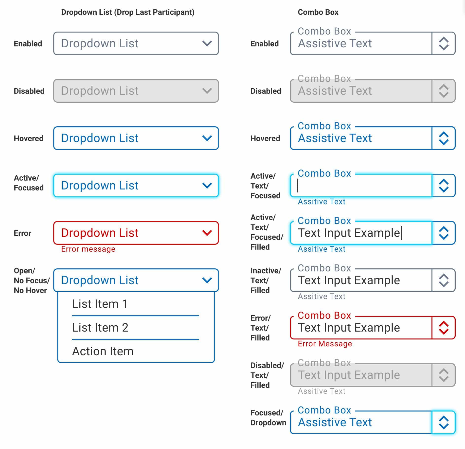
Buttons may not seem like an obvious place to start, but the majority of our interactions began with buttons. After buttons, we designed other controls, dropdowns, forms, menus, tables, lists, and more. Then came the layout of the main user interface. Before showing you the finished design, let’s look at some of these assets.
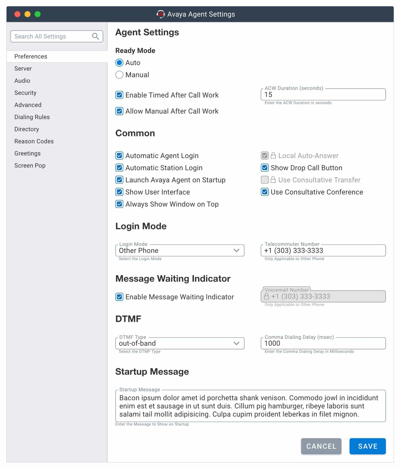
I’d like to highlight the UX-friendly interface controls; I merged the best concepts from Google, Apple, and Microsoft into a simple take on modern UI controls. I also designed a “Combo Box” that meets all current accessibility standards. The combo box is mostly used by Microsoft and hasn’t yet been embraced in other design systems. It also doesn’t have a native HTML object for the web. Even still, I’m an advocate for the combo box because it gives the user more interactive freedom in less space.
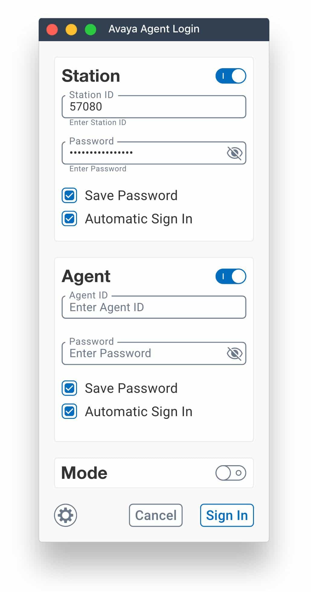
The Final Designs – AAfD 2.x
After creating hundreds of assets, it was time to design window frames and start creating the user interface. While this was strictly a desktop app, our design system was platform-agnostic for future mobile updates. Here are the finished designs.
Discussing the Designs
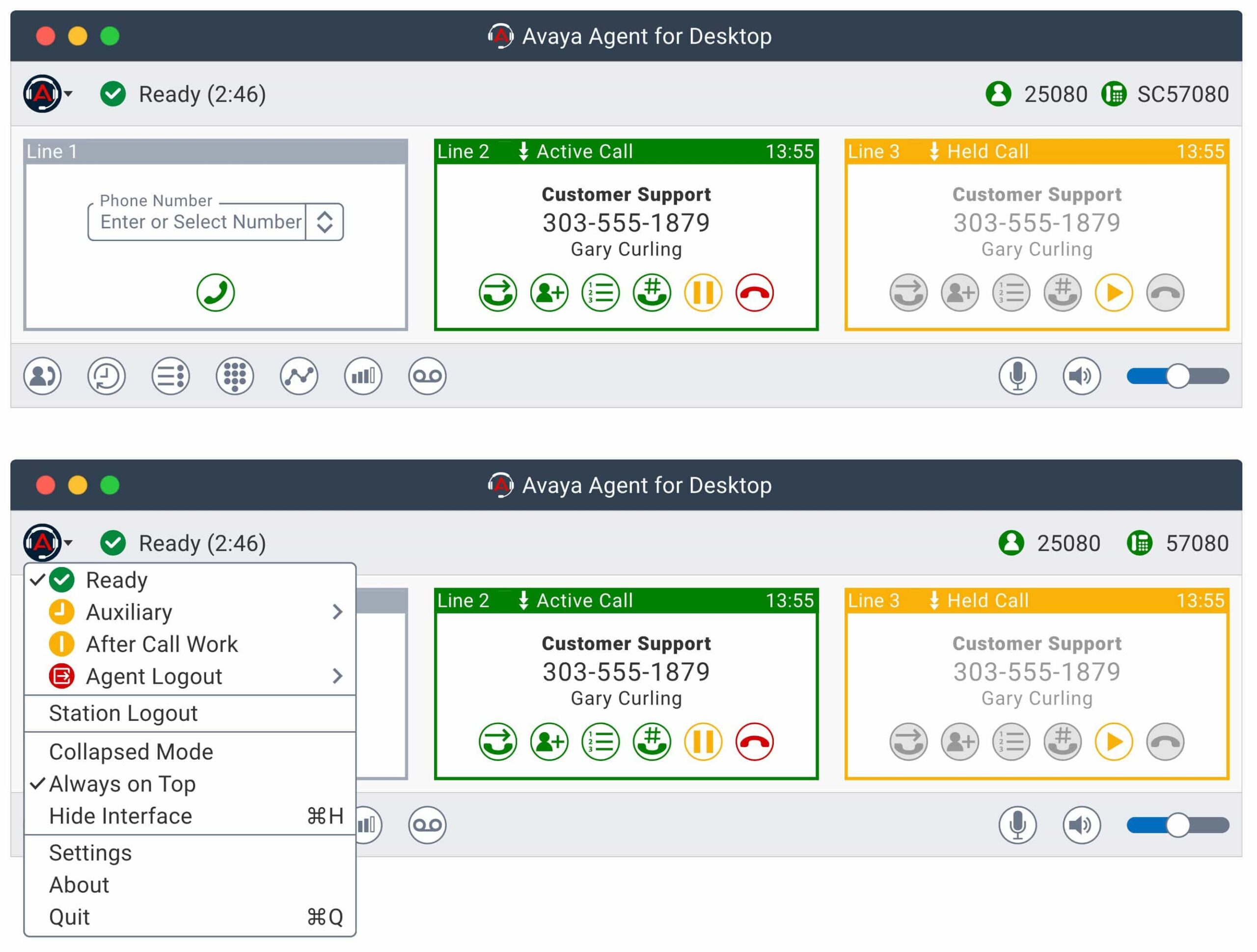
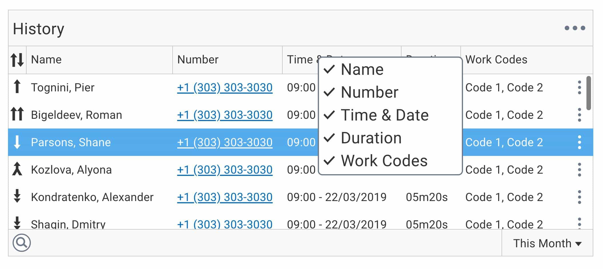
Clean, simple, and modern… but we still needed it to feel similar to the original 1.x designs. We changed the layout and many of the interactions to accommodate the newly mandated accessibility requirements. Too many interactions in 1.x required users to navigate across the app to continue the workflow. In contrast, 2.x grouped many interactions and eliminated those that broke accessibility guidelines.
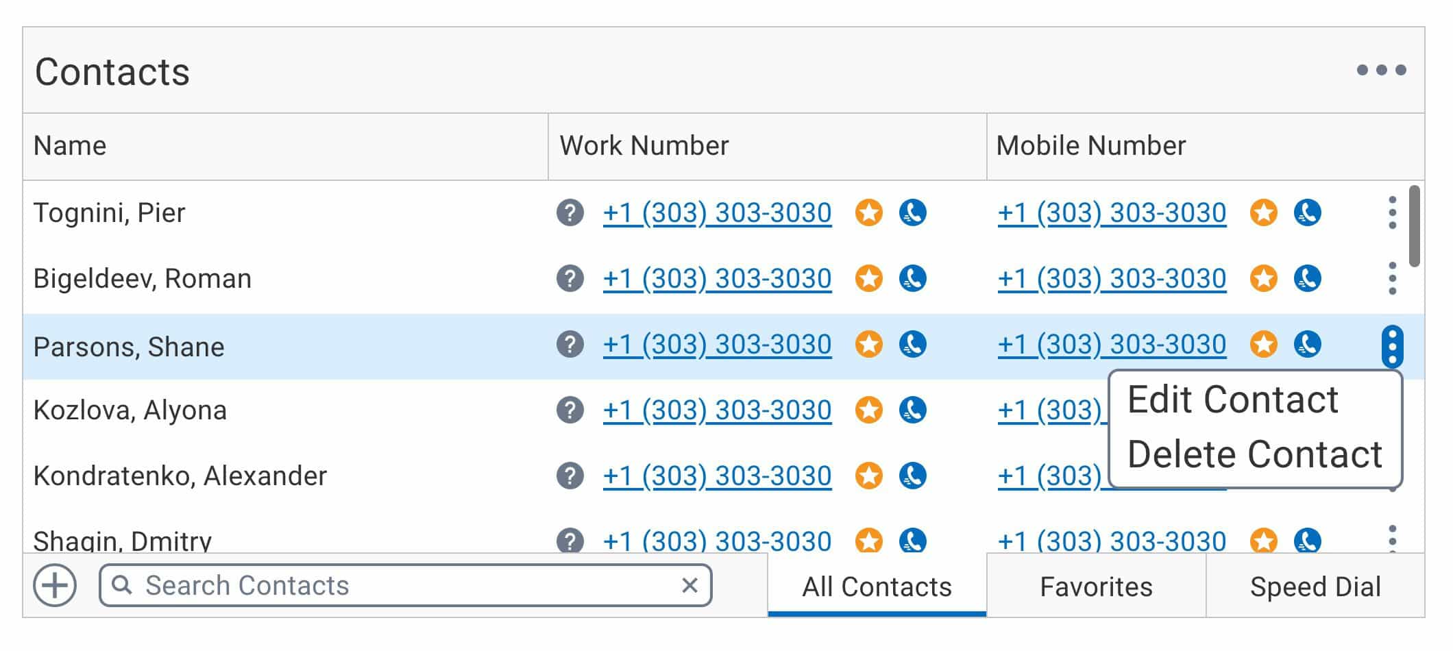
Call appearances are the perfect example of grouping interactions. In the 1.x designs, starting a call, dialing, and the controls were far from each other. Now, all those interactions live inside the same card; users move a few pixels not inches. Because of those improvements, our users move the mouse less — saving them time and the company money.
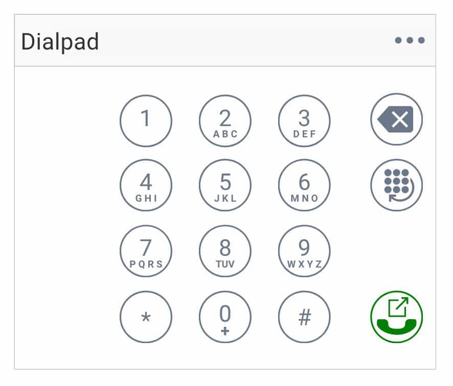
In the new UI, we have the menu and status at the top and the call appearances in cards below. There are detachable tools in the bottom left, and audio controls in the bottom right. The tools were designed to be reactive. If you open a single tool, it docks at the bottom of the main window in a full-width layout. Open a second tool, and it will split them 50/50 unless you drag and drop it otherwise. Each tool renders as 1, 2, or 3 columns; they also detach or undock as a separate window entirely.
Wrapping Up
With UX at the center of every conversation, my devs started looking for the right solutions instead of the easy ones. Once you embrace UX, it’s impossible to banish it back to the fiery chasm whence it came. I shouldn’t imply that the user experience is “The Ring,” but let’s roll with it. It consumes you with jealousy for great interactions and makes you feel safe when you’re in its presence. Too much? Probably, I’ll see myself out.
Before I go, allow me to leave you with a before and after shot of AAfD so you can compare the work we did on 2.x with 1.x. It was certainly a fun and challenging project.
